About Bersin by Deloitte

Bersin by Deloitte is a subscription based service that delivers research and strategies to the HR professional


Situation

The search functionality is not responsive, leading to usability issues on tablets and mobile devices. Its complexity appears to cater primarily to technically savvy users, which excludes a broader audience.

Task

Improve customer satisfaction by modernizing the search user experience, making it more intuitive and accessible for all users.

Action/design process

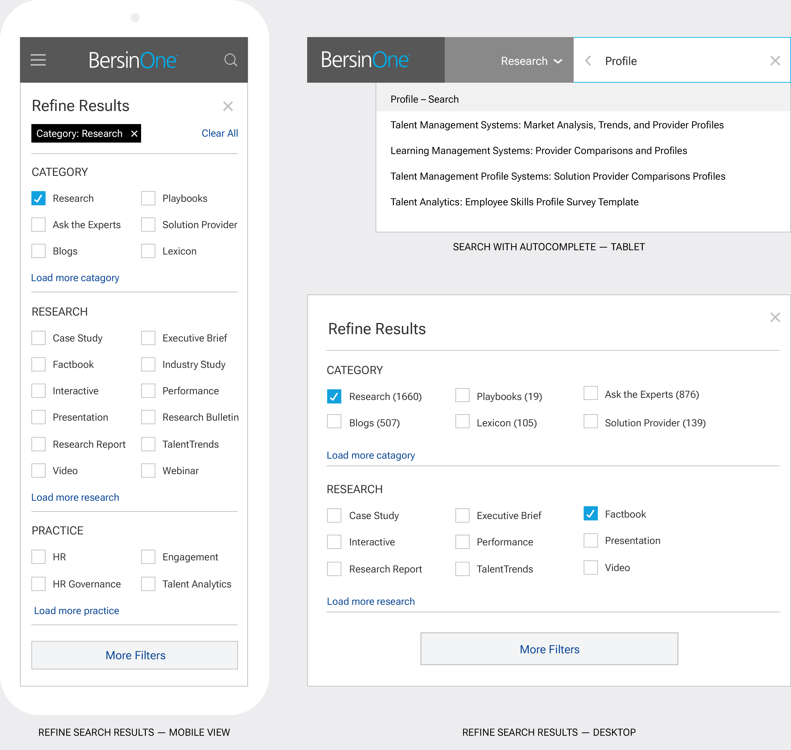
Following in-depth research and collaborative discussions within the team, we decided to implement the Material Design pattern, customizing it to meet our specific needs and requirements.

Result

Customers expressed enthusiasm for the responsive design, noting an increased likelihood of returning to the site.

One year after launch, subscriptions rose by 15%, and we realized cost savings on future development by designing the search component to be reusable.

Client

Deloitte, San Francisco CA

My role

UX Designer

Team

Product owner, developer, content strategist and UX designer

Tools

Adobe Illustrator

Timeline
Three sprints — 30 days

Date

2017

Discover

Problem statement • User research • Features • Material Design

Problem statement

Our customers need a modern, streamlined search experience that allows them to easily navigate the site using an iPad or mobile device.

User research

Fortunately, the research team had already conducted some initial studies, giving us valuable insights to build upon.

Key findings

  • Reduced engagement: 64% of our users access the site via iPad or mobile devices, but the search functionality isn’t user-friendly. As a result, they prefer to manually navigate through menus and pages, which is both time-consuming and frustrating.
  • Decreased conversion rates: 22% of our customers who sign up for a trial do not continue their subscription because they struggle to discover content that interests them.
  • Limited accessibility: We could optimize for accessability by providing improving keyboard navigation, aria labels, contrast ratios and correct use of focus order.
  • Power user efficiency and simplicity: Power users who rely on comprehensive search have expressed interest in using devices like iPads and are requesting a more modernized search UI to enhance their experience.

Feedback from customers

Pain points

  • Search is difficult to use and is often viewed as a last resort
  • Customers tend to use the default settings because the filters are perceived as too complicated
  • Search filtering appears complex due to the overwhelming number of drop-down options
  • Customers are frustrated by their inability to effectively use search on tablets or mobile devices

Customer quotes

  • “I can’t find what I’m looking for”
  • “Looks complicated”
  • “Too many results”
  • “Doesn’t work on my iPad”
  • “Why isn’t it as good as Google?”

Feedback from our business partners

  • Missed insights: Search analytics offer valuable insights into user behavior and preferences. Without a responsive search component, you risk missing out on critical data about what users are searching for and how they engage with your content.
  • Missed personalization opportunities — more relevant research: Search components integrated with personalization algorithms tailor results to individual user preferences. By encouraging more users to utilize the search feature, we can deliver more relevant and targeted content, enhancing their overall experience.
  • Competitive disadvantage: Many modern websites and platforms now offer responsive search functionality as a standard feature. Lacking this capability could place your website at a competitive disadvantage and make it less appealing to users.

Search vs. navigation

Our team debated the merits of search versus top-level navigation, particularly whether a well-designed search pattern could replace traditional top-level navigation.

We ultimately concluded that a combination of both search and navigation would offer the most optimal user experience, balancing direct access to information with intuitive exploration.

Material Design system

We decided to use Material Design for the foundation for our search pattern because of its high level of familiarity and recognition.

Additionally, it is well-documented, making implementation smoother. We will customize the component to incorporate our unique features and branding.

Exploration

Search Model • Wireframes • Design • Specifications

Search model


Wireframe


Final design


Specifications


Conclusion

Customers showed enthusiasm for the responsive design, highlighting a greater likelihood of returning to the site. Specific feedback included, "I can finally view research on my iPad," and "Discovering new content is much easier now."

One year after launch, subscriptions rose by 15%, and we realized cost savings on future development by designing the search component to be reusable.


Update

Since I helped develop this search component, research has shown that replacing the search icon in the header with a search field leads to improved user engagement.